
Though I extol the freedom of expression that doing your own digitizing provides, not every embroiderer will become a digitizer. Whether due to a lack of resources or interest, many embroiderers would much rather purchase stock designs and hire out any custom digitizing than delve into the depths of digitizing for themselves. For those who can’t or don’t want to create their own designs from scratch, the following are some basic, but very useful, editing skills that don’t require you to learn all the ins and outs of digitizing.

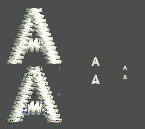
1. Refining Lettering. Even full-time commercial digitizers sometimes use pre-digitized or ‘keyboard’ typefaces on occasion. That said, we almost always refine our ‘canned’ lettering and so should you, if your software allows. First, kern your letters to make sure they are attractively spaced. Nothing looks sloppier than rampantly uneven spacing between letters. Bad enough kerning can even make one word look like two.

If your software allows you to alter the elements that make up the letters, you can also ‘open up’ the counters (holes) in small letters for more legible stitching. When these counters are smaller than roughly 1mm square, they may stitch poorly, closing up or opening eyelets in your garment when stitched. You can expand them, dropping crossbars on the occasional ‘A’ or enlarging the gaps in the errant ‘p’ or ‘b’.

2. Measuring Density. Understanding proper coverage and being able to determine the density of a stitched element is crucial to knowing how a design will run on a given garment. Learn to use the included measuring tool in your software; With it you can unlock the secrets of any design. On fill or Tatami stitches, density is measured from the center of one row of stitches, skipping over the next row, ending on the third. On satin stitches, density is easiest to measure at the edge of any given column, from one point where two stitches meet to the next. Standard full coverage should be roughly .4mm apart, though structured underlays may allow for lighter, more widely space stitching that still maintains coverage of the ground. One should expect to see lower densities when a lighter hand is preferred: overly dense designs warp and buckle, especially on light materials- you can avoid them if you can spot them. Once you have a ‘known good’ reference design (one that runs the way you want it to on a given substrate), use these measuring techniques to discover the density the digitizer is using. Those measurements allow you to evaluate other stock designs for a similar material, or to request densities for your specific garment/material from your contract digitizer .

3. Adjusting Compensation for Pull and Push distortion. The most common problem caused by pull and push is poor outline registration. An existing design might have passable coverage on a new type of material, but the borders and outlines may not track their underlying fills or the heights of letters may appear uneven. When a minor compensation problem exists, even stitch-by-stitch editing software may enable you to correct this by removing or adding stitches to the ends of satin columns or by increasing the width of satin stitches or the edge stitches on a fill. Stitches ‘pull’ or shorten compared to their on-screen appearance and that satins and fills ‘push’ toward the ‘open’ sides to finish slightly outside (or inside) the lines presented on-screen, but you don’t necessarily need to understand that if you’ve already created a sample. Simply measure the amount that the design finished ‘off’ and move/remove stitches enough to compensate. This often means that a stitch on will look out of register, landing beyond or before where you want it to finish. If you do read up on compensation, knowing how this distortion works will help you to diagnose potential registration problems when looking at a design on-screen before your run, allowing you to salvage the design with simple edits without excessive trial and error.

4. Adding or correcting underlay. Correcting poor or missing underlay can have a tremendous effect on the outcome of your design. When lettering sinks into a highly-textured substrate, Adding a paired edge-walk and zigzag underlay will lift it out of the pile. When an element has a ragged edge or ‘pulls’ to narrow and falls out just of register, a judicious run of edge-walk can make it toe the line by giving it an edge for those stitches to hold. Underlay helps elements maintain shape, lift above textures, or achieve proper coverage. Measuring and previewing the run of a good reference design can teach a great deal here. Observe pattern of any underlay, measure how far edge walks are tucked under elements, stitch lengths, and you’ll be familiar with your digitizer’s techniques, allowing you to ask for the kind of underlay you need or to make small repairs yourself. You may think that without the master files or access to your digitizer’s original software that you are stuck, being as you can’t change the parameters of the automatic underlay. In truth, the best, most carefully structured underlay is often manually digitized. Any editing, even one that can only operate one stitch at a time, can produce wonderful underlays with a little bit of self-education and careful measurement. Simply find the stitch point that begins your element and plot the underlay stitches out and back from there, returning to the point where the element’s top-stitching begins.

If you only buy high-quality stock and work with skilled digitizers, you may never have to concern yourself with these technicalities. That said, if you endeavor to learn these basic techniques you won’t be caught out of hand when the day comes where no digitizer can be contacted to fix your custom file or a beautiful stock design that you are dying to use has some small failing. If you never decide to create a design in your life, you’ll still be glad to to have the power to tweak the ones you use.
–—
![]() Erich Campbell is an award-winning machine embroidery digitizer and designer and a decorated apparel industry expert, frequently contributing articles and interviews to embroidery industry magazines such as Stitches and Printwear as well as a host of blogs, social media groups, and other industry resources.
Erich Campbell is an award-winning machine embroidery digitizer and designer and a decorated apparel industry expert, frequently contributing articles and interviews to embroidery industry magazines such as Stitches and Printwear as well as a host of blogs, social media groups, and other industry resources.
Erich is an evangelist for the craft, a stitch-obsessed embroidery believer, and firmly holds to constant, lifelong learning and the free exchange of technique and experience through conversations with his fellow stitch-workers. A small collection of his original stock designs can be found at The Only Stitch