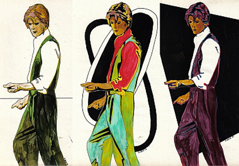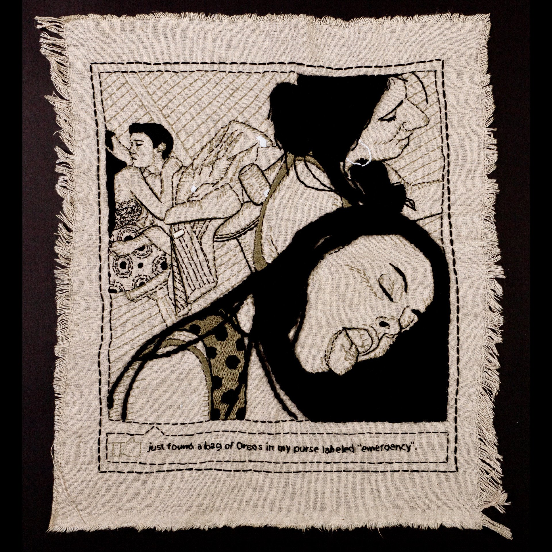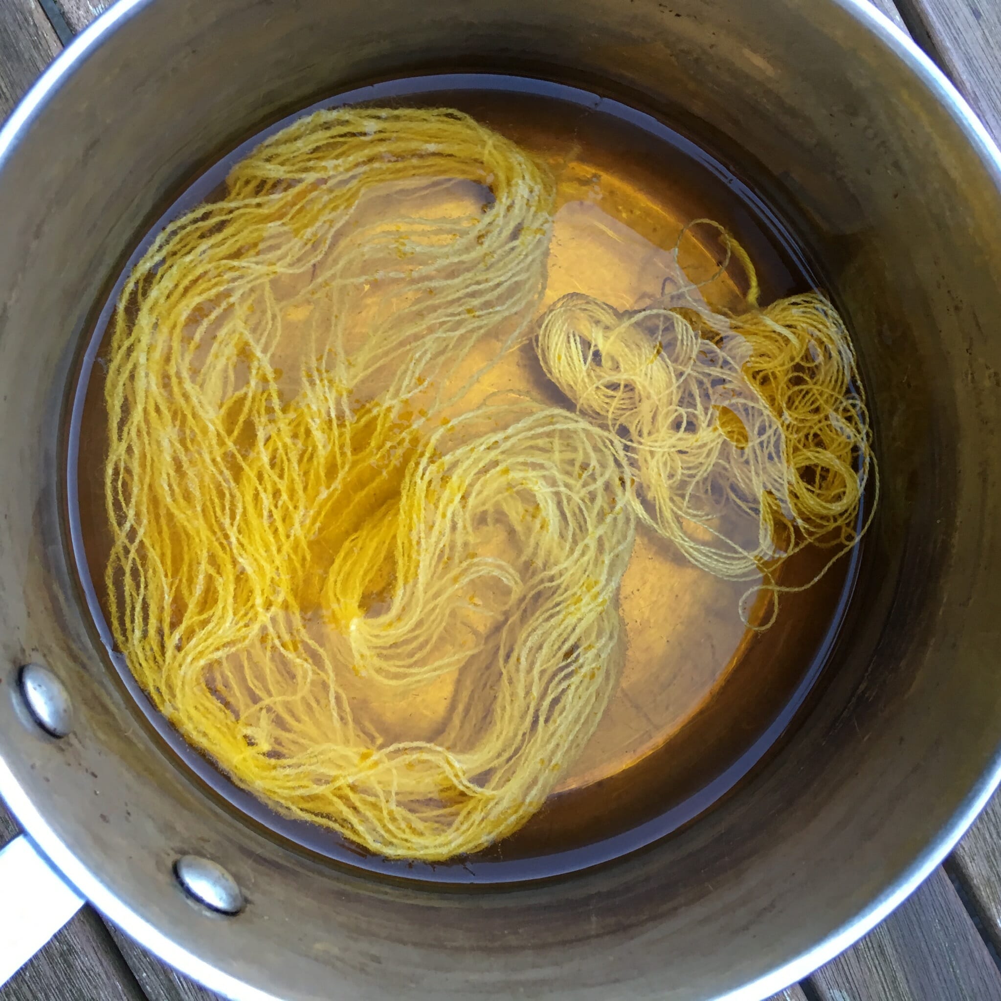
Hello, Fibristas and Fibristos! I’m Arlee and every month, ARTeries will lead you to broader interpretations of “embroidery”. Occasionally we will also delve into theory, concept, mechanics and the nuts and bolts of design. This time we are going to explore the “c” word. That’s right, Colour. A lot of people are afraid of colour. Is your kitchen beige? Are your sheets white? Do you secretly wear red underwear? Let’s talk a blue streak about the basics.

Colour is a powerful force we all experience daily. Everyone feels and sees rainbows differently, a unique experience to each person. As textile artists, we need colour: it shapes our thread choices, our vision of what we are making, the final result, the way it is perceived and received by the viewer. It sets the mood and completes the idea. It can’t be inferred or implied: it’s there, whether banal or sublime, whatever subject matter and method. It can define good art and craft or relegate your work to the back drawer at a flea market. It’s an intrinsic part of design: a good design can be ruined by the wrong colour choices, a bad one, well, it’s better than nothing.
The facts:
1. Darker colours have more visual weight–they add stability to the lower part of a design. That doesn’t mean dividing the area into colours, but just being aware of the total effect. You can do this by photographing the piece, converting to black and white or squinting hard at it pinned up on your design wall. Small amounts can accent, larger, well, go gothic.
2. Black and white are not “not colours”—they add a powerful sense of dimension. A judicious line of black or white can define an edge, patch disparate elements together or create a secondary focal point to add to the story.
3. Everyone gets confused about hues, shades, tints and tones— hue is the descriptive name of a colour ie red, red-violet, not “passionate purple”. Shade determines the value, the lightness or darkness of a colour. Added to a pure hue, black creates shades, white creates a tint, grey creates tones.
Because textiles are quite a different approach than paint, experiment with overlays of sheers, tulles, laces and meshes, or over-wash with thinned paints. Combining several threads into one can help with this as well, whether by hand or on the machine. You can do this to create the base fabric before you add stitching and embellishments, or on top of any work, depending on the effect you want.
4. CHROMA is the brightness or dullness of a colour and decreases as you move in either direction from the pure colour. Lightness doesn’t always mean brighter. “The aspect of color in the Munsell color system by which a sample appears to differ from a gray of the same lightness or brightness and that corresponds to saturation of the perceived color.” Pretty high falutin’—just think of limes and lemons in sunshine as opposed to limes and lemons in a dim room. Chroma can be enhanced in textiles by using metallics in the same (or opposing) colour family you are working with.
5. Upon discovering that colour could be separated into different components, Isaac Newton sketched the first colour wheel, but is struck on the head by a 2 pound granny smith while attempting his first embroidery. Subsequently colour blind, he is forced to abandon the needle arts and pursue physics.
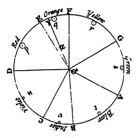
(Above, Newton’s color circle, showing the colors correlated with musical notes and symbols for the planet.)
6. Triadic Harmony: “Art” critic is fatally wounded when distracted by cutting edge triadic colour placement on opponent’s floss bandolier. (The winner coins phrase “dressed to kill”.) A triad is a colour harmony developed by 3 colours equidistant to each other on the colour wheel.
7. Just like Switzerland, red-violet is the most neutral of all colours, neither warm nor cool, active nor passive. Almost all colours are enhanced by it. If you’ve got coin to stash, try an Alpine ABM; if you have vibrancy issues, get out the red-violet.
8. Indecision is the devil’s studio—in any colour harmony, it’s important that the main colour be dominant and the others enhance it. Pick your main colour and stick with it—otherwise your design can look as if it were done with no thought! Or don’t, but be aware of size, texture and placement. When your mother said you might be the next Jackson Pollock, it wasn’t necessarily a compliment.
9. Terms:
Analagous – 3 adjacent colours–a key colour either primary or secondary, and the 2 colours on either side.
Complementary – harmony of 2 colours exactly opposite to each other on colour wheel—–this can be a difficult one to get right in proportion: think of all those blogs that use deep red on dark green–can you read them?????
Split Component – harmony with key colour and 2 colours on either side of its direct opposite.
Triad – see number 6. Intermediate – or Tertiary – mix of primary and a secondary i.e. red-orange (red and yellow), yellow green (yellow and blue), blue-violet (red and blue). Secondary – a mix of 2 primaries, primaries are always only ever RED, YELLOW and BLUE.
The ideas:
Good colour wheels can be found at any decent art supply shop and are an indispensable tool until you “learn” colour and retain a “muscle memory” of it.
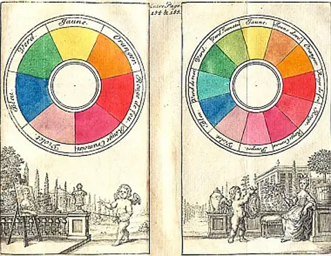
(above, 1708 colour wheel by Claude Boutet)
If you’re in a rut design-wise or find yourself always using the same colours, it can kick you in the butt to try something different. Another good way to learn colour is to get all those paint chips from the hardware store—the colour names are subjective though— one person’s purple is another’s aubergine is another’s twilight violet—and try different combos.
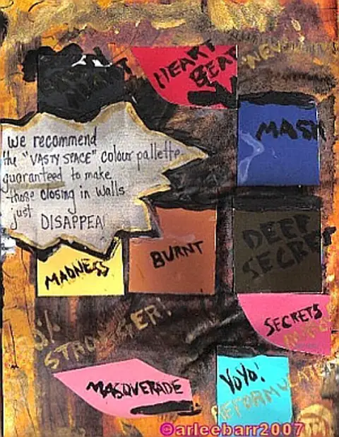
Cut them up and make your own personal colour wheel. Fling the pieces at your main fabric and see what sticks. Put a photo in an editing program and switch palette colours.
You can shock, calm or repel with colour as well, either as it is “normally” perceived, or using it in an unexpected way. The colour of the “embellishments” can greatly affect the mood as well–if you took delicate white and cream laces, then used raw uneven stitching/beading/burning in fiery red or almost black purple with a shot of electric blue, you’d get quite a different feel than using neutral tones and precise hand or machine stitching. Don’t do this just because you can, do it because the art “works” that way. Try a series of small samples, the first in black and white using your fave medium, do a second using primary colours only and a third combining the previous two. As a fourth, get out your fave colour and one that you rarely use–don’t worry if it doesn’t “go”—try smaller amounts of either and experiment with placement, texture and size. If you always use the same colours, try their exact opposites.
Most importantly, we all see colour differently. It affects mood, appetite, food choices, sex, art and life. Don’t be afraid to break, ignore, and make up your own rules. An understanding of colour may take you to a new level, steer you in a new direction. To quote a friend: “…can a color define the steps you’re taking? Can it tell you what you’ll see or who you will meet?” RoseMoo (Rose Howard)

