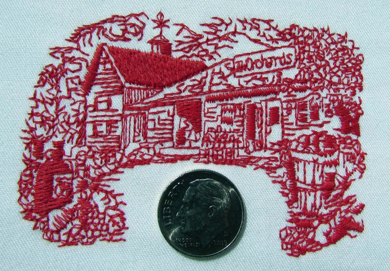
 It’s hard not to love a single-color machine embroidery design; there’s no need to re-thread the design for different colors, most won’t have problems with registration, and the stitch counts are often low, so they finish fast. The sad thing is that some digitizers can get lazy in their execution, making them boring slabs of unidirectional fill or uniform lines. Engraving-look pieces might be too dense, or too open, following the original art without thinking of thread weight and simple graphical pieces may have been run through the auto-digitizing mill and suffer from thoughtless transitions between stitch types. Though single-color designs might not be the stunners that make jaws drop when you haul them out at your next crafty gathering, there’s no reason not to use all the qualities thread has in store to make them stand out as much as possible. If we think about the way thread ‘works’ with light and give due consideration when we are translating our source material, we can take these simple designs from dull to dazzling. In part one of this 2-part exploration of the simpler side of machine embroidery, we’ll discuss the qualities embroidery has to help us to create visual interest, even with a severely limited palette.
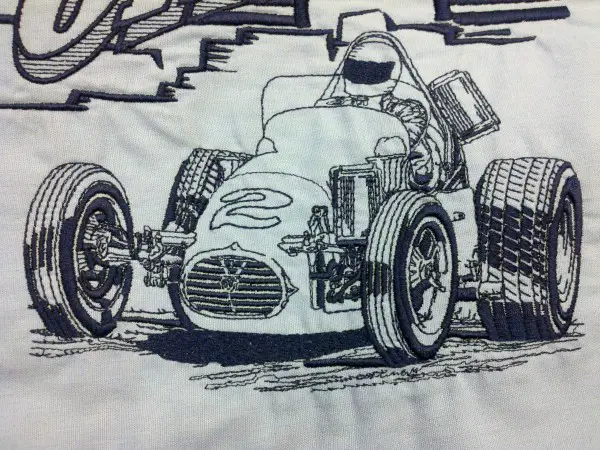
Texture: Standard embroidery thread has an incredible sheen that selectively and directionally reflects light in different ways. Moreover, specialty threads with natural fibers or matte finishes can allow us to explore contrast in texture. Add that to our ground fabric and we have the chance to play with contrasts and comparisons just on the material basis alone. If that weren’t enough, machine embroidery allows us to chance texture through the way we create stitches; long stitches that lie in a common direction can look shiny, while short stitches can look rougher and duller. Regular patterns with offset stitch penetrations look smooth and man-made, while random stitch penetration placement in a filled area can make an element look textured and organic, let alone the amazing things we can do with programmable stitch patterns in our software. Texture can be an incredible source of extra impact.

Depth: You can literally altering the height of an element through embossing, using stitches to compress a thick material, or embroidering over support materials like foam, or you can figuratively create depth through the sequence of elements you stitch and layering, or by using the texture and angles of stitches to make subtle shifts in color through the way that thread reflects light differently depending on the angle at which it is viewed, there are numerous options for digitizing and embroidering in way that more resembles sculpture than drawing or painting. By building our overlapped elements from the back of the image up to the picture plane, we can benefit from the natural depth that an occluded item in our image causes us to interpret. Using these tricks and those gleaned from other arenas of art, we can make a design figuratively and/or literally stand up from the ground and be noticed.
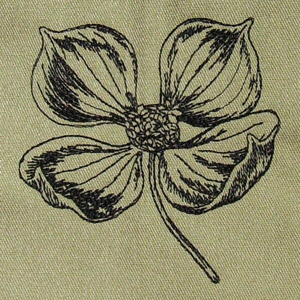
Density: Density, as many readers here may know, is just a technical way to say ‘the space between stitches” If you carefully consider how far apart your lines of stitching are from each other or how much coverage an area has, you can create variations of shade and light in your piece. The techniques of almost any style of line art are applicable here; study engravings and woodcuts, and you’ll understand how a single-color design can come to life.
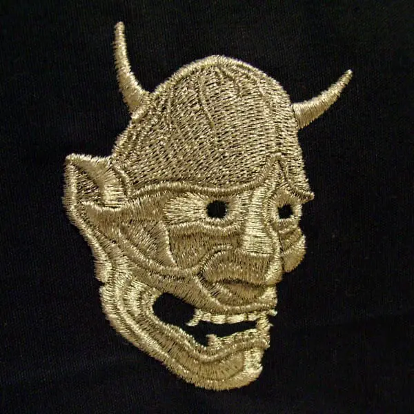
Color: You might not think color can make a difference when we are talking about single-color designs, but the truth is that different colors of thread perform differently and that in any embroidery you always have at least 2 colors to work with, that of the thread and that of the ground. Lighter thread colors show more shadow and will give you a bit more sense of depth, darker and duller colors will make areas more flat. Moreover, with the substrate’s color thrown in the mix, you can now play with the levels of contrast between the stitching and ground. Everything from tone-on-tone monochrome to complete opposing contrast can be done with single color designs, just remember than straight stitch lines look more full and complete with dark threads, while light threads on dark backgrounds tend to look broken in straight stitch lines.
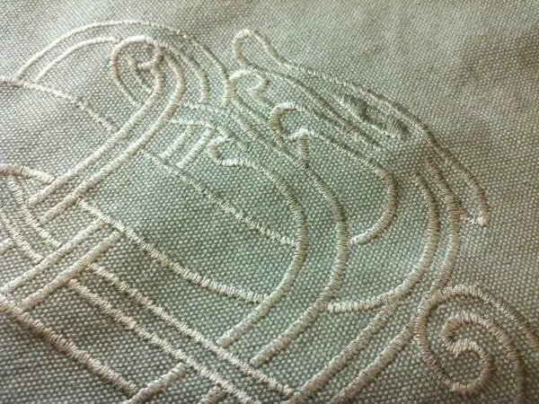
Line Weight: This applies to everything from the relative width of a column of satin stitches to the number of passes one traces over a single line of straight stitch. Thin lines can make a design look open, airy, and fluid, while bold, thick lines can make a design look heavy, thick, and sturdy. Uniform lines can make a design look man-made or machined, while varying a line’s weight along the length of a line can make a line look more hand-made or organic.
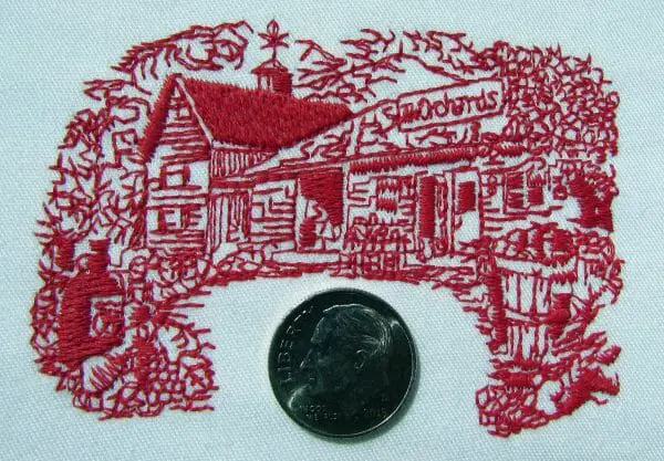
Single-color designs are a great way to get started in embroidery digitizing and haven’t yet managed to go out of style. From the old-school tea-towel redwork to name-drops, to full-on masterpieces, you can take that simplicity of palette as far as you want once you learn to control the things that make thread magic. Study your thread, play with it in the light, hold up threads and fabrics together and muse on the contrast and comparison. You’ll be glad you took it seriously when your single color piece sees the light and your crafty compatriots see just how much you can do without a second cone of thread.
—–
 Erich Campbell is the Partner Relationship Manager at DecoNetwork, an award-winning machine embroidery digitizer and designer and a decorated apparel industry expert, frequently contributing articles and interviews to embroidery industry magazines such as Printwear, Images Magazine UK, and Wearables as well as a host of blogs, social media groups, and other industry resources.
Erich is an evangelist for the craft, a stitch-obsessed embroidery believer, and firmly holds to constant, lifelong learning and the free exchange of technique and experience through conversations with his fellow embroiderers. A small collection of his original stock designs can be found at The Only Stitch

