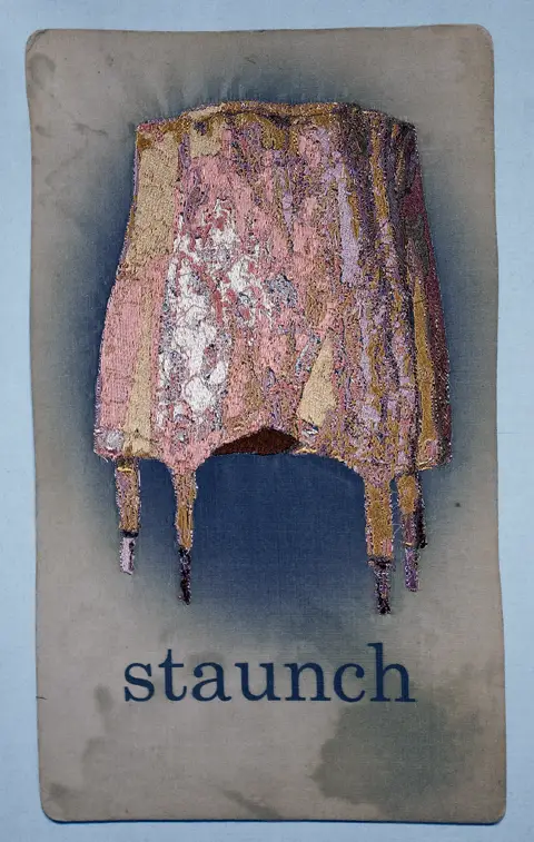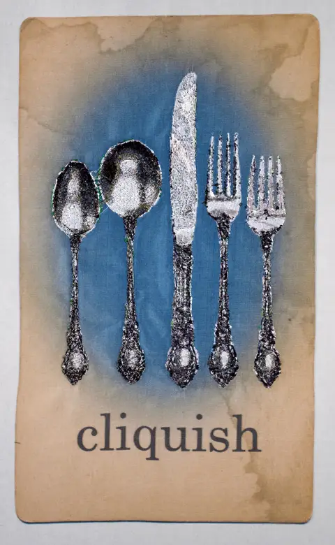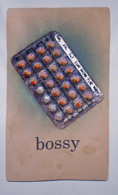
Jess Larson is a mixed media artist from Minnesota. Her machine embroidered art explores contemporary pressure on feminine norms, by reproducing classic icons with a subversive twist.
“My work subverts common objects or beliefs to examine the complex terrain that women must navigate in order to shape an identity within a culture offering mixed directives in that pursuit. The conceptual goal is to illuminate the lack of positive, if not reasonable, feminist social messages by specifically delving into the dearth of negative ones in order to reclaim or destroy them from within. Interjecting humor into the critique not only exploits the absurd agendas of such “norms,” but also creates a more hospitable situation to introduce contrary arguments defining why they do not serve women well when considered with a bit of laughter.
“I deliberately use source materials from the eras belonging to my mother and grandmother in the construction of my imagery ”from vintage girdles, dresses, alphabets, to flash cards used to educate children ”as these items reference a bygone era but convey my intentions much clearer than such items from contemporary times.
“Beginning this research in 1993 as a young, third-wave feminist, I saw a lack of organized direction in the movement and noticed an overwhelming excess of mixed messages of how to craft aspects of my own identity. While no dominant voice informed those choices, I and other women of my generation had still managed to internalize those familiar meta-messages, and reinforce them on one another, ”especially if someone was bold enough to defy those stereotypes. Notions of “good girl” and “bad girl” had shifted since mid 20th century, but the consequences of defiance or failure to achieve certain benchmarks are strikingly familiar.
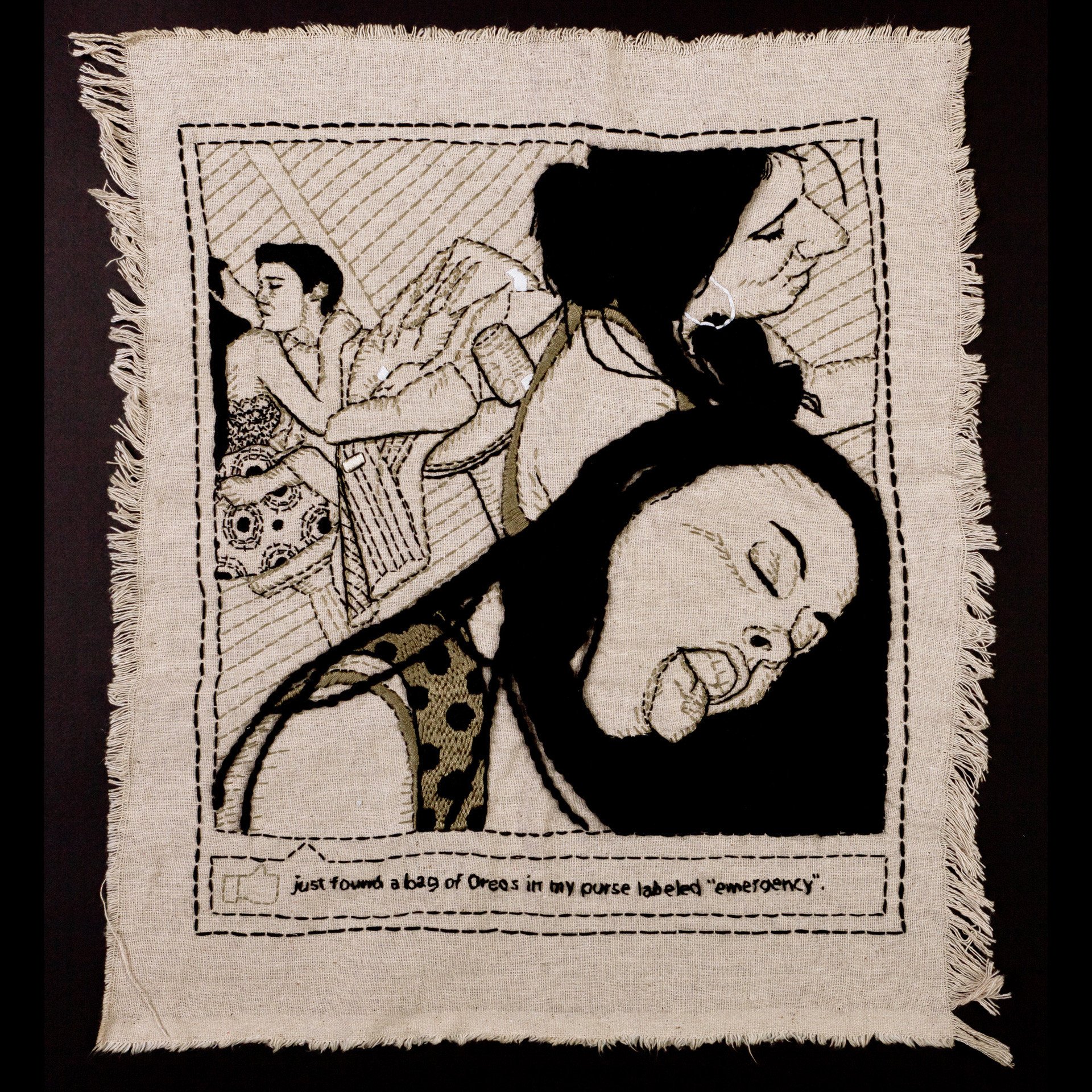
“Production methods used to make the work are diverse in media and skills, including women’s handcrafts, couture sewing, digitized embroidery and digital imaging. Time is another key element in my artwork, as I am attracted to repetitive activities that yield rich textures through obsessive accumulations of marks or surface manipulations. My pieces are neither sculpture, computer generated imagery, nor garment in their purest form–but rather a chimerical mixture of what I find interesting or necessary about these mediums combined with the time and effort to complete a single gallery-ready object.
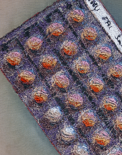
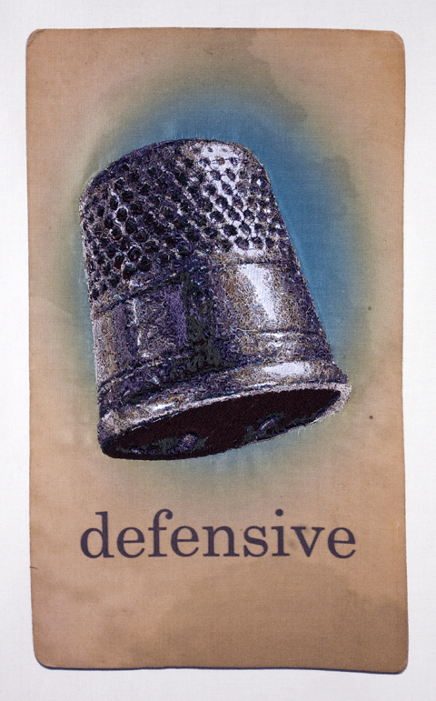
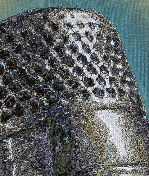
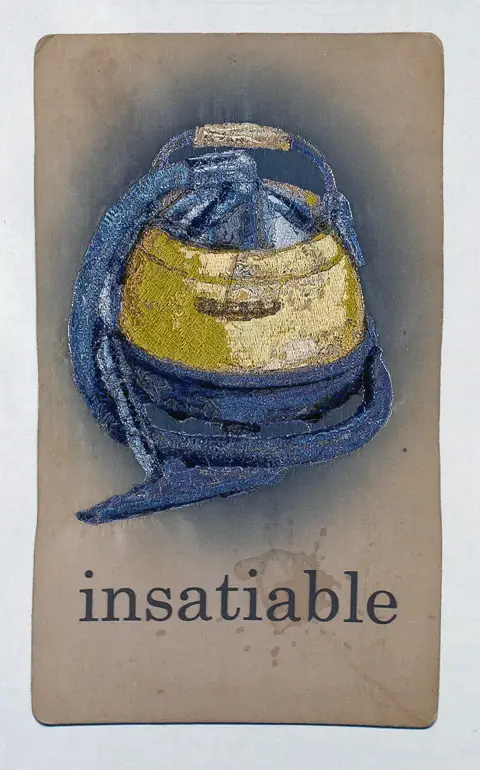
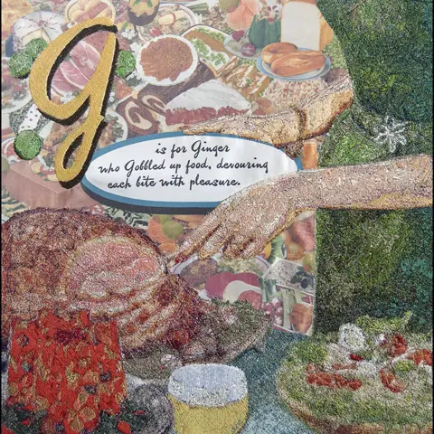
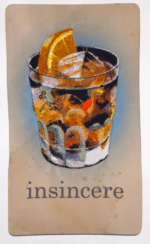
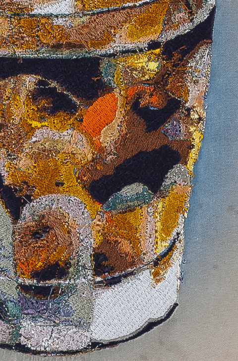
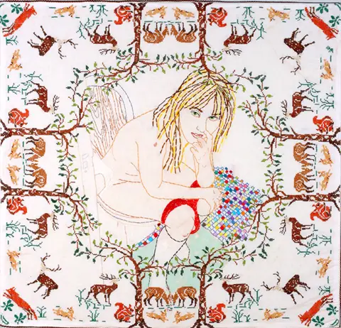
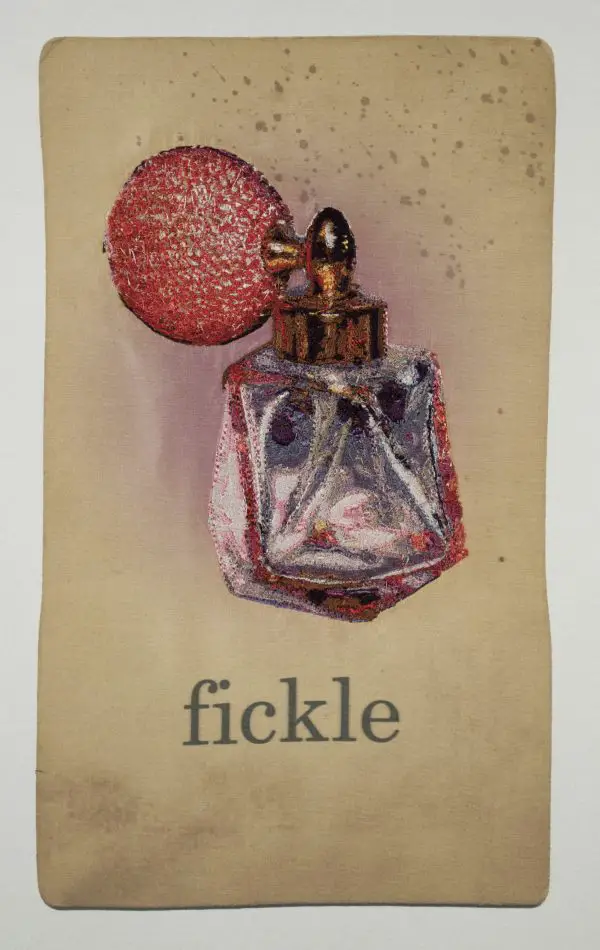
“Look and Learn, Little Girl is a continuing series that specifically examines the language associated with women’s roles and behaviors as they negotiate personal relationships. These are two-dimensional works based on imagery from 1950’s era mass media, organized digitally and printed on silk fabric run through an inkjet printer. Text and additional imagery is then added by hand or mechanically using a sewing machine capable of “stitching out” almost photo-realistic images from digital files originated from scans or photographs.
“It is intended that this collection be a more humorous and approachable means to discuss how women perceive their “place” and the conflicting messages that have been internalized via social conditioning. Using irony, absurdity and sarcasm to frame these themes, as well as a visual format similar to “Dick and Jane” style flashcards, I ask viewers to consider the positive or negative consequences that women attempt to reconcile by conforming to stereotypically passive or aggressive means of behavior.
“The Alphabet of Regrettable Behaviors questions the notion of “What makes a good girl?” Is it the one who does what is expected of her or the one who does what is good for her? I am deliberately using actions that would be considered transgressive to perceived traditional roles to question the idea of regret or taboo behaviors.
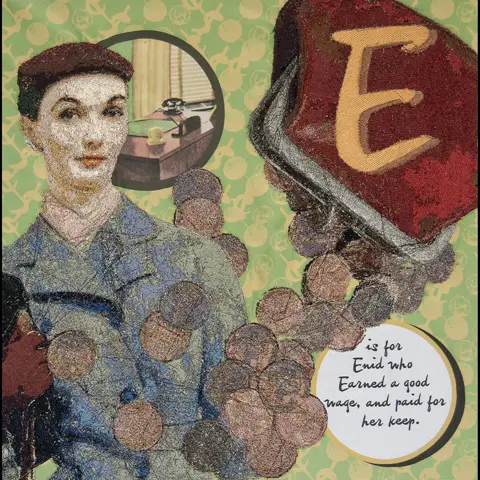
“The text structure for the artwork is based on examples from traditional alphabet books for children and by the structure Edward Gorey used in many of his darkly comic alphabets. Letters are paired, assigned a name of a woman and a behavior with the same letter, and must end in a rhyme. For example:
E is for Enid who Earned a good wage, and paid for her keep.
F is for Fern who Faked it, because she’d rather get some sleep.
G is for Ginger who Gobbled up food, devouring each bite with pleasure.
H is for Holly who flaunted her Hips, so curvy and ample of measure.
“The images are gleaned from a large collection of 1950’s and 1960’s women’s’ magazines, including Mademoiselle, Seventeen, Good Housekeeping, McCall’s, and Better Homes and Gardens. I am taking imagery from advertising and other story layouts to form characters and contexts for the series. For the background imagery, I am working from historical examples of textile design, but changing the elements to include elements that relate back to the theme of each letter.“
Jess’ work combines sophisticated production techniques with intelligent subject matter to create work that is appealing on a multitude of levels. In a similar approach to that of Jennifer Boe, the mundane icons of modern female life are granted elevated status and brought forth for your reconsideration.
Jess’ methods of construction draw you into the work; her ability to create near photo-realism with machine stitch encourages you to look at the work closely and pay attention to the details.
Placed within the familiar context of flash cards, the work is both contemporary and timeless. Find out more about Jess and her work at her website.


