

If you follow embroiderers and digitizers online, you’ll often find yourself dazzled by the complex work that they do; smooth gradient blends comprised of many colors, individually laid stitches built into complex patterns and textures, massive works of multimedia requiring several processes and hours of run-time. Though there is something to be said for those larger works, and I have enjoyed the dropped jaws and praise for the few pieces of mine that reach into that sphere of detailed or difficult work, I still have a great respect and love for simpler pieces. There’s something to be said for a simple, elegant piece of functional embroidery.
To that end, I decided to show you a brief process for a rare project I did for myself recently. Rather than dwell too long on deep technical issues or show you the most impressive work I can manage, I decided to share a simple bit of stitching to get you thinking about how to integrate embroidery into an everyday task, and let the joy of both creating a piece move from the realm of daunting masterwork to something more grounded.

That Tears It
This starts with a little mishap. Here in the American Southwest, it has been scorching hot, and I tend to over-dress in the heat. After a great deal of prodding, I finally moved from my long-sleeve button-up shirt to a short-sleeved short after finding a particularly comfortable black and grey plaid piece in a lightweight cloth. No sooner did I finally purchase and put it on, though, that I managed to snag it viciously on a nail. Rather than remorsefully recycle it or just bear with standard stitching around the jagged ‘L’ torn in the yoke, I decided to us my skills and repair with embroidery. It can be easy for corporate embroiderers to forget that stitching is more than logotypes and decoration, but I hearkened back to an earlier, smaller patch I did when I snagged a shirt in my first embroidery shop, long before I became the digitizer I am now. Back then I had to use a heavy stock design to cover the hole, but it distorted the light fabric and wasn’t really to my taste. Now, free to create whatever I like, and with my understanding of stitching and structure, I could easily make a functional and attractive cover-up design.

In this instance, I decided to go with something completely classic; a vintage custom monogram, executed in a single-color, using a tone-on-tone scheme. Subtle, simple, and more importantly, something I could achieve in the tiny amount of time I had to work. Besides, with a black-on-black piece I could use the car-enthusiasts term my mechanic dad’s young friends would throw out for a similar paint job; ‘Murdered Out’ – sounds violent, but way cooler somehow than most of my thread colors.
Use the Source
First, let me get something off of my chest; though I don’t have anything against folks who do this, with monograms, I’m usually not content with simply laying out some letters in a conventional typeface and making one larger. It’s not that I haven’t done this on order, nor that it can’t look good, but for me, I really like monograms that either have a custom typeface with differently shaped glyphs per position, or better yet, letters drawn specifically to go together as a whole. I want to see custom shapes and often some form of interlacing strokes. This is why I turn to historical examples of monograms and ciphers. For this piece, I was working with a small amount of free time, so rather than draw something entirely of my own, I decided to take an example directly from scans out of old public domain texts; this time, I started my quest at Gutenberg.org.

A quick search for ‘Monograms’ lead me back to an old favorite for such inspiration, Monograms & Ciphers by Albert Angus Turbayne, a classic published in 1906. I scrolled through the scans of plate after plate of lovely interlocked lettering, looking for something with an E and a C – it wasn’t long before I came upon a piece I had to have. I grabbed the image, cut out the monogram that caught my eye, saved the cropped image and switched over to my digitizing software. Very little time investment, copyright safe art, and already on my way to setting stitches, I could already see the possibilities.
The Cover Up
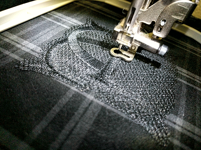
In my software, I started with the most critical factor in any digitizing project; sizing. The size of your finished piece dictates everything about stitch length, overlaps, the amount of detail you can safely pack into a space, and in this piece, whether or not I’d actually successfully repair with embroidery the tear in my garment. I grabbed my handy retractable cloth tape, measured the unsightly tear, and drew a quick rectangle in the software that matched the outer edges of the damaged area. This served as a guide as I decided on the size and orientation of my art and eventual design. I opened up my cropped monogram pic, sized it so that the monogram itself would just about take up the area of the tear, and then I created a foundation that would actually be handling the repair.

I drew a shape, a contour following the rough outline of the monogram but extending 5mm on all sides from the glyphs. I then filled this with a standard stepped fill stitch, starting with a vertical underlay at a density of 1.6mm and finishing with a fill perpendicular to the underlay, also at 1.6mm density, to create a loose mesh of stitching that I knew could not only handily stitch the torn flap of fabric down to the black scrap of stabilizer I had squirreled away for just such a project, but that would obscure the tear and offer a light, even texture and a perfect foundation for the monogram above. This is only a quarter of the stitching one would use to get a full coverage fill on contrasting colors – I used just enough thread to get some coverage, to repair with embroidery but not enough to overly stiffen the garment.
A Man of Letters
Now it was time for my favorite digitizing task; creating the glyphs. The settings were fairly simple- I wanted to use a single column of satin stitch for each stroke so that I would get some contrast from the shine of the unbroken, long threads of the satin stitch against the lightly pebbled texture of the underlying mesh. I decided to ignore the chiseled midlines in the historical example, and started breaking the letters into individual strokes, taking time to refine the curves as I redrew them from the source. I took extra pains to make sure that overlaps looked truly dimensional, so that any stroke that looked to be behind another actually had stitches that were underneath those of the top stroke.


The trick is that each stroke goes over and under in such a way that simply creating each stroke as an unbroken element would mean eventually having to fake or lose this realistic looking overlap. To combat this I created small sections of the strokes that dove under others before the rest of said stroke would actually run. This allowed me to make it look unbroken while allowing this underlying section to actually stitch under a stroke that was earlier in the sequence than the rest of the stroke could run. With these sections in place, I could later travel back to them and complete the stroke to give it that seamless look. If that made as much sense to you in text as I think it did, check the embedded video below for a better look at the sequence I’m talking about. For each junction, you’ll see me pull the trick that makes strokes look like they stitched impossibly both before and after another stroke in the piece.
The settings on my lettering were similarly light as the foundational fill, with only half the density one might expect on a standard, contrasting color design. The density was set to .8 mm or 8 points, with the edges of the satin stitch columns bolstered by an edge run underlay inset just over a millimeter from the finished edge.
Hoop Dreams
With my digitizing done, all that was left was to stitch. I hooped up a piece of light black cut-away stabilizer both to stabilize the embroidery and to serve as part of the patch, centering the tear in my hoop, and loaded up my embroidery file. I centered the design on the area of the tear, using the machine’s in-build edge tracing to check if the outer edges of the design were really going to cover the area as needed. With the foot traveling well outside the edge of the area I needed to cover, I dropped the foot and set the machine running.

I fretted a bit as to whether I should have adhered the flap to the stabilizer, but I had sequenced and guided the direction of the run so that it would smooth out the torn flap with the presser foot and stitch it down as it moved, and it did just as I had intended. The flap was tacked down by the underlay, obscured by the foundational fill, and made into something bordering on attractive by the borrowed glyphs from my historical master and the small input of my choices about texture and dimension. With none to please but myself, I decided to let go of the worry and truly enjoy watching this piece run.

Stitching it all Together – Repair With Embroidery!
In the end, I found many lessons to learn from this simple project. First, sometimes the better part of keeping fashion from being trash is to learn how to do a repair, and such a repair need not make a piece look worse. The worth of the piece can improve, even through the imperfection and the history that exposes. Second, no matter what you love to do, take some time to do it for yourself. Though we can be tough critics of our own work, and I’d change the design if I did it again today, it was good to do something purely for my own pleasure and not for the money, the likes, or to impress. If you ever have something you are scared to learn, learn it on a passion project for yourself, and let the work and the process please you as much as the product. Last, but far from least, sometimes less is more. Using just the stitching I needed, and no more, made for a nice soft hand to the decorated garment. Using slightly altered found art rather than waiting for a time I could draft my own custom and likely more complex piece meant I actually managed to do the work in the little time I had. Using a single color and efficient practices meant I went from concept to completed piece quickly. There is room for masterpieces, but sometimes our most pressing challenge is to act, to get something out there, knowing we learn, and do it all over again, bigger and better the next time we venture out. Sometimes a simple piece gets you unstuck and stitching rather than dithering over something ‘greater’ you think you should have done. In the end, you’ll always be happier for the stitches you set, albeit imperfectly, than you will be for the ones you didn’t run while you waited for a better project or a better time.

![]()
Erich Campbell is the Partner Relationship Manager at DecoNetwork, an award-winning machine embroidery digitizer and designer and a decorated apparel industry expert, frequently contributing articles and interviews to embroidery industry magazines such as Printwear, Images Magazine UK, and Wearables as well as a host of blogs, social media groups, and other industry resources.
Erich is an evangelist for the craft, a stitch-obsessed embroidery believer, and firmly holds to constant, lifelong learning and the free exchange of technique and experience through conversations with his fellow embroiderers. A small collection of his original stock designs can be found at The Only Stitch

